In my free time, I volunteer as a book cover designer for Indie Novella, an independent publishing house.
So far I have designed covers for two books that have been published through Indie Novella, which you can see below.
Joined Up

Joined Up was a collaborative creation between the author and myself, by having an open and friendly flow of discussion with each other throughout the design process. To bring the author’s book cover vision into reality with some design guidance from myself.


The front cover depicts 4 of main characters at the bottom within the silhouette of the main character Scott.
I chose to have the character’s faces hidden, with no specific skin color, because it then allows the readers to use their own imagination to fill in the blanks of what the characters’ appearance is like, at the same time creates a correlation between the small illustrative characters and the rest of the cover, so that it does not appear that the characters have been carelessly placed on top of the oversized silhouette.
I chose to have the character’s faces hidden, with no specific skin color, because it then allows the readers to use their own imagination to fill in the blanks of what the characters’ appearance is like, at the same time creates a correlation between the small illustrative characters and the rest of the cover, so that it does not appear that the characters have been carelessly placed on top of the oversized silhouette.
The characters clothing is a mix of grey tones, to make the characters not seem too heavy or blocky, but instead create subtle interesting features that are not too distracting from the main title.
On the back cover stands Scott alone, which was an author’s request to have, to allow the empty space to be filled up.
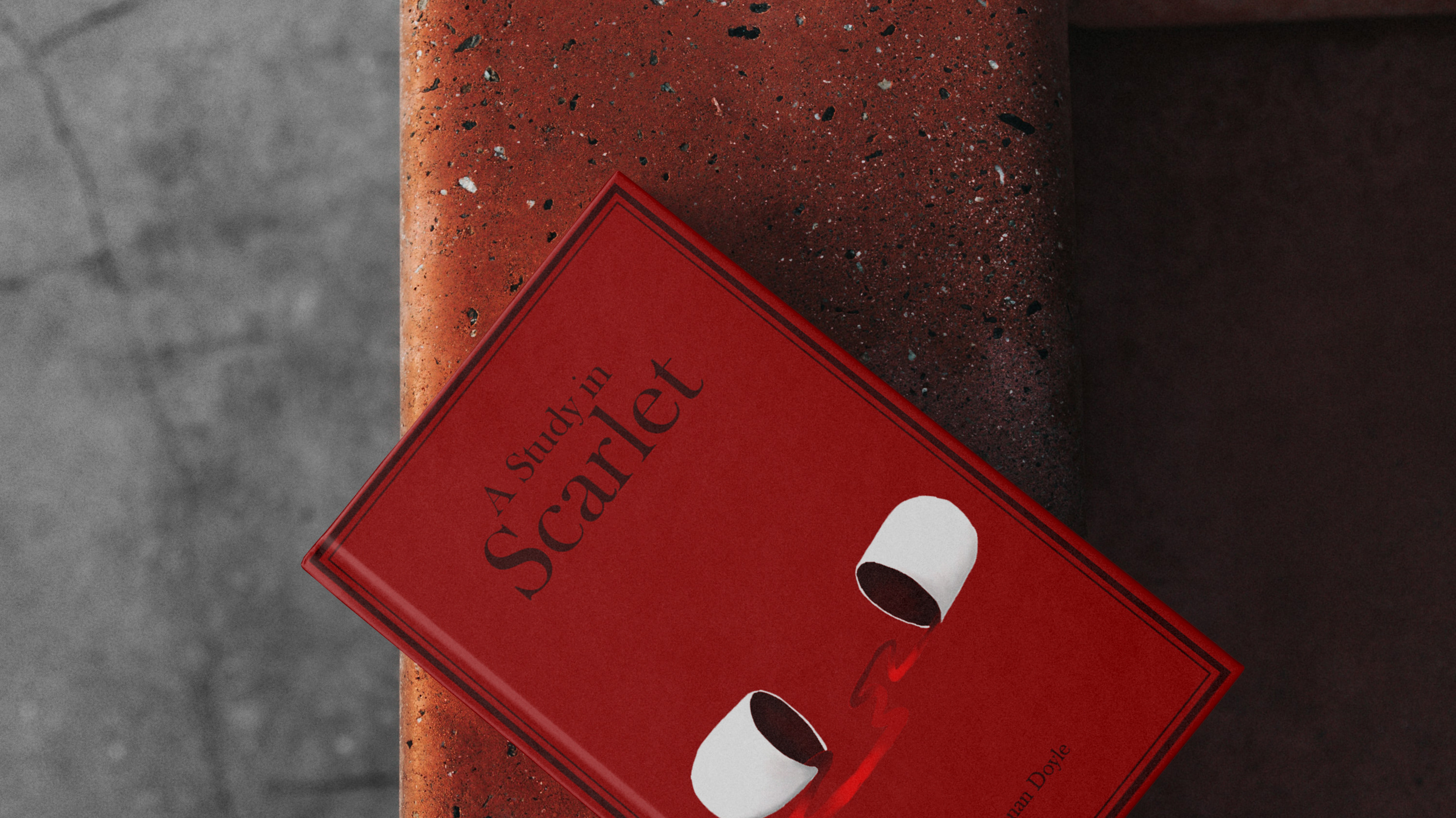
A Study in Scarlet

A Study in Scarlet has been my recent project for Indie Novella. With this cover, I did not have the restraints of the author's opinion, which allowed me to have wider creative freedom, but still needed to abide by Indie Novella design guidelines.
For A Study in Scarlet, my aim was to reflect the plot of the novel rather than aesthetically depicting the main character Sherlock Holmes, since as a designer I try to challenge myself to think differently. The cover depicts an open pill capsule with a scarlet thread spilling out, this concept was inspired by Arthur Conan Doyle line, ‘scarlet thread of murder running through the colourless skein of life’ and a suspected murder weapon.
Whilst wanting to design a more original cover concept, I still wanted the aesthetic of the book to emulate 1887 (originally publishing date), which is why I added elements of a traditional vintage book, for instance choosing a deep red colour scheme and creating a slightly simpler border that is didn’t distract the viewer from the main focal point.