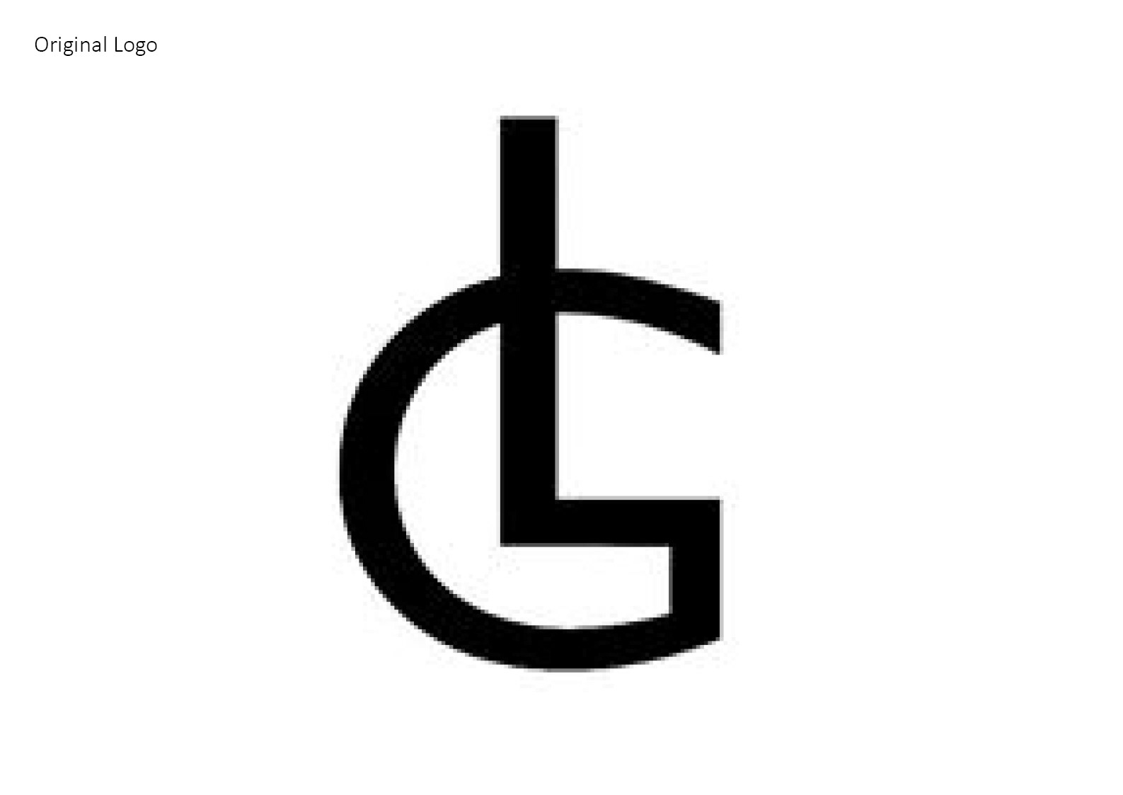
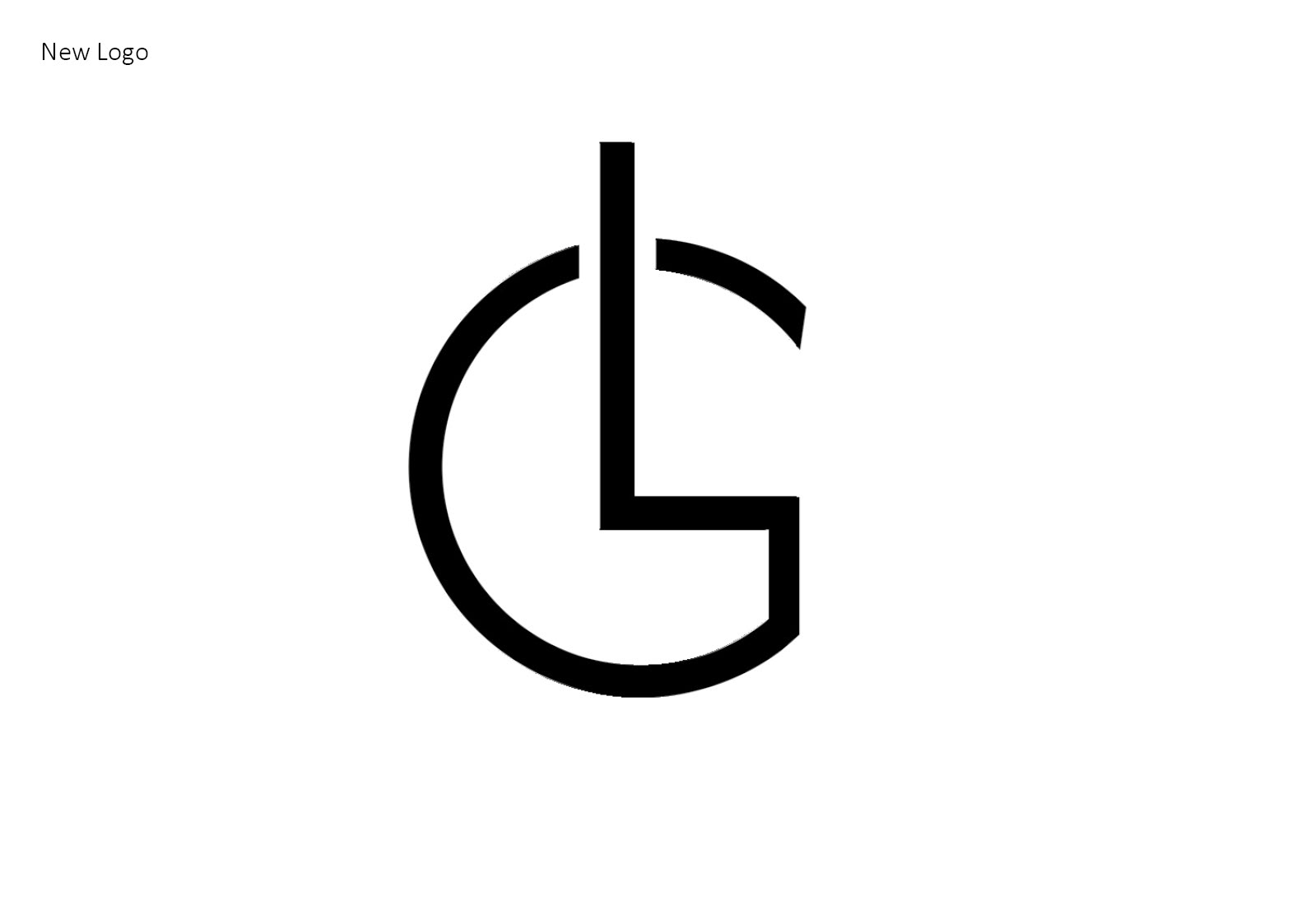
My original logo was created in first year of university. Since then I have developed the logo.
I have made various changes to my logo which are:
- Changed the ‘L’ y making it more defied from the ‘G’ ad made the ‘L’ more proportioned with the ‘G’ since before it’s had too much height to it,
- Made the ‘G’ wider and have better curvature to it, so the logo has better space ad does look so compact ad squished,
- Thickened out the monogram as well, since I thought that the logo looked to chucky ad did not look sleek ad clear, which I believe reflects my personal taste ad style.
My aim is to have my logo reflect my personality and personal design style I like.
I like chic & classy, discreet nothing too dramatic ad exaggerated, less is more. I wanted my logo to be diverse ad easy to manipulate for other purposes. I wat it to be strong enough to carry itself without any colour or decorative boarder around it.
I believe that I have accomplished these characteristics.